Framing Art — 101
Everyone wants the artwork they have created or purchased to look it best when hanging on a wall.
Framing shops have guidelines they go by but it really depends on the piece itself, where it will be hanging and personal preference of the owner. This is why going into the frame shop to make your decisions often eliminates many mistakes.
Professional framers typically agree on some basic guidelines for artwork such as oils and acrylics. Here are just a few:
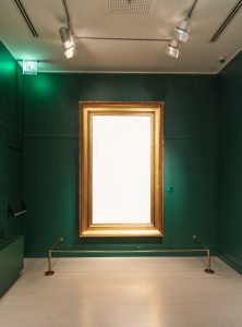
1- Classical painting often look great in gold leaf or a dark elegant wood like walnut or mahogany frames
2- Abstract or Contemporary art seem to shine in simple or sharp edged frames
3- Other art such as lighter or more abstract paintings may look best in sleek, less fussy frames
4- For paintings that are in-between, you can go the traditional route or contemporary
5- For large art works take look at a wide moulding. Over 1000 sample moulding on site.
6- The color of the frame should not compete with the colors in the art work but compliment them
7- Don’t feel like you need to match the other frames you have hanging now—variety is the spice of life
8- Basics for framing art on paper for art such as watercolors, pastels, charcoal drawings and others: it is important to be mounted first on support material such as archival foam board with acid free adhesives or corner pockets with a good glass for protection
9- Glass: Regular glass is ok if the work is not overly expensive or will not be in direct sunlight, non-glare is best for those pieces of art exposed to UV rays, museum glass is the top of the line—it offers a clear and glare free experience. Gallery 17.92 offers all three types of glazing to meet your needs.